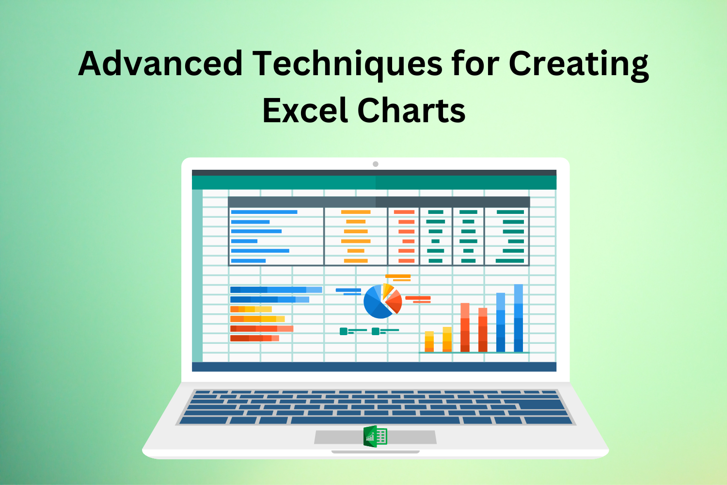
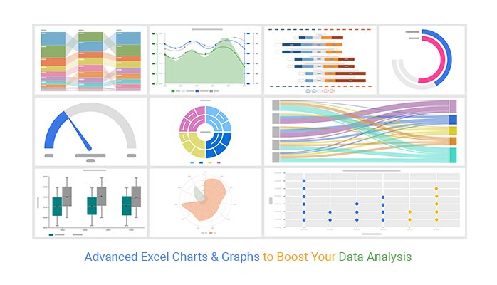
Even though most users can use basic features of Excels charts, if you want to take your data visualisation to the next level, you should learn advanced charting techniques. This blog helps you learn How to Make a Chart in Excel using advanced techniques. These advanced techniques will help you communicate complex information and make better decisions, whether you’re a data analyst, a business professional, or doing Excel Courses.
Utilising Dynamic Chart Titles and Labels: Excel Charts
With the help of dynamic chart titles and labels, you can make interactive charts and update themselves when your data changes. Chart elements can be dynamically customised, and context-specific information can be provided by linking chart titles and labels to cells that contain dynamic text or formulas. Excel Charts titles can be dynamically updated using cell references or named ranges with the latest data metrics. Data labels can also change as values are updated. This feature’s increased chart usability and flexibility allow stakeholders to understand your data better.
Creating Combination Charts for Comparative Analysis: Excel Charts
Multiple series can be presented in a single chart area using combination Excel Charts, which are ideal for comparative analysis. Line, column, bar, and area charts can be utilised in conjunction with one another to compare and analyse multiple data sets at once, which allows for more in-depth insights and trend analysis. Combination charts, which combine line charts to depict trends with stacked column charts to show categories, are one example. This method improves the readability and clarity of your charts by letting you express complicated correlations and relationships.
Implementing Advanced Chart Formatting and Customisation: Excel Charts
Excel gives you many tools to make your charts look better and create a more significant impression. Modifying the chart’s layout, adding custom styles and themes, and adjusting the scales of the axes are all examples of advanced Excel Charts formatting techniques. Furthermore, you can personalise data markers, gridlines, and axis labels to match your unique tastes and brand standards. Make data-driven decisions with the help of visually appealing and engaging charts made with professional-looking tools and techniques for advanced formatting.

Incorporating Trendlines and Forecasting: Excel Charts
Better forecasting and predictive analysis are made possible when trendlines are added to Excel Charts to reveal hidden patterns, correlations, and trends in the data. If you’re looking to predict future sales, demand patterns, or financial performance indicators using past data, this feature is for you.
Creating Interactive Dashboard: Excel Charts
Making Interactive Dashboard Charts: An interactive dashboard is an excellent tool if you need to see and analyse a lot of data quickly and easily. You can construct dynamic dashboard Excel Charts using Excel’s data validation, slicer, and interactive control features. Users can dynamically filter and manipulate data by incorporating dropdown lists, scroll bars, or option buttons. This allows them to drill down into specific subsets or explore different scenarios. Stakeholders can acquire insights and make better decisions with the help of this interactive approach, which boosts user engagement and makes data exploration easier.

Incorporating Sparklines for Data Trends Visualisation
Sparklines visually shows trends in data within a single cell. They are small, compact Excel Charts. Without taking up too much room or using too many chart objects, these small charts make it easy to see patterns, trends, and variations in the data. For various kinds of data analysis, Excel Charts provides three distinct Sparklines: Line, Column, and Win/Loss. You can quickly find trends, outliers, and confined data series comparisons by inserting Sparklines alongside your data. Adding context to tabular data, making visual summaries for dashboards, and displaying trends in big datasets are all areas where sparklines shine.
Conclusion
If you want your stakeholders to understand your financial reports, sales projections, or performance metrics better and act on them, you need to use advanced Excel Charts techniques. By understanding Excel’s charting features and practising what you learn, you can make interactive visualisations that boost confidence and propel your projects and activities to success.
Read More